Instagram: Makeamark_artroom

Showing posts with label shape. Show all posts

Monday, January 2, 2017

Kandinsky Inspired Abstract Painting


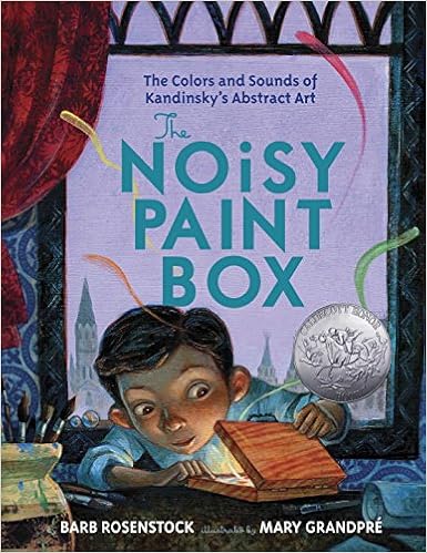
First grade artists were introduced to the artist Wassily Kandinsky. I shared the book, "The Noisy Paintbox" written by Barb Rosenstock.
I appreciate the rich language and artwork in this book, though some of the vocabulary is beyond the 1st grade lexicon, it can be adapted for the younger set. For example, when the word cobalt is used, I say, "Cobalt Blue". Just so my kids, have some bearing on what is being communicated.

https://images-na.ssl-images-amazon.com/images/I/61qKw4VkdAL._SX383_BO1,204,203,200_.jpg

We discussed the lines, shapes and colors of his paintings and how they were named using musical words.

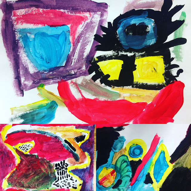
Students offered their interpretations of his paintings and then set to work creating paintings using red, yellow, and turquoise crayola tempera paint. I encouraged them to work with yellow first, then red, then turquoise, mixing colors directly on their paper. They rediscovered/remembered that these colors create orange, purple, and green...the secondary colors. Last,  they used black to create final details. I did give some guidance in asking them to paint 2 shapes with yellow paint, 2 lines with red, and 2 more shapes with blue. They could make any shapes or lines they wished.


Of course, I made sure to play some Tchaikovsky while they painted! 


The goal was to review primary and secondary color mixing and use lines, shapes and colors to create an abstract painting inspired by Wassily Kandinksy. Here are their results!


What I discovered is my students began to mix complementary colors to create neutral tones and were saying, "I made brown! I made a golden color!" They were so excited about the range of hues they were able to make by just mixing the primary colors. Each painting was unique. 

Thanks for reading!


Sunday, October 9, 2016

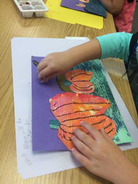
Painted Paper Pumpkins created by 1st Grade


I really love the look of painted paper and my students seem to REALLY enjoy creating them. I was inspired to teach this lesson by looking at the work of Laura Lohmann over at The Painted Paper. She is the master in my opinion and the work her students create in the Fall is absolutely stunning. You can check it out here.

We spent a lot of time exploring and using a variety of painting tools in creating textures in paint. It was a blast!Then we set to creating warm & cool color painted papers.


The next class we looked at geometric vs. organic shapes. With their cool papers, they were to create 2 geometric rectangles. With their warm papers, they were challenged to draw organic pumpkin shapes and cut them out for collage. They demonstrated their understanding of drawing, cutting, overlapping, and collage techniques in assembling their Pumpkin landscapes.


The last class, they were given oil pastels to add details like highlights, shadows, vines, stars, a moon, and more. Most students were compelled to transform their pumpkins in to Jack-o-lanterns since Halloween is closing in and it is a huge part of their visual culture.


I love to see their imaginations come alive in the last part of adding artistic details.

Thanks for stopping by!


Friday, December 4, 2015

"The Raven" W.I.P. 2nd grade

The 2nd grade has been studying landscapes and practicing the 5 basic elements of shape in drawing. We have been learning how objects can appear to be bigger or smaller depending on how close they are to the viewer.  In drawing 2-D, the 2nd graders understand that they can visually communicate distance and space by changing the sizes of objects in their art.

To practice their skills I asked them to create an artwork in response to the book, "The Raven: A Trickster Tale From the Pacific Northwest" written by Gerald McDermott. I read them the book with my document camera and asked them if the Raven was close to us or farther away in each picture. This was a really quick way to assess their comprehension of this spatial concept.

I really love the bold "form-line" design in the illustrations.

Is he near or far?
Is he near or far? How do you know?

After I finished the story I guided the class in the drawing of the Raven. We focused on identifying the basic shapes seen in the original illustration from the book. After that, I asked the class to create a landscape in the distance to emphasize that the bird was near the viewer. Here are some "wips" (Works in Progress) from one class.


What a striking looking eye.

This artist used Seattle Seahawks colors.
This artist really wanted to focus on color patterns, saving the landscape for last.

I am pleased to see these kids are growing in their drawing skills. I've noticed that when we do these guided drawings together they are getting better at identifying basic shapes and translating that in their own drawings.  They are beginning to understand that being able to draw is more about seeing than raw talent.

Thanks for stopping by and reading!