Instagram: Makeamark_artroom

Showing posts with label art history. Show all posts

Monday, July 11, 2016

Printmaking Bonanza Part 1: Kinder -2


It is Summer and I have to admit, my blogging fell to the wayside. I got married a couple of weeks ago and let's just say writing up posts wasn't a priority in the final weeks of school.

I finished my last day of teaching this year on June 20th and was married 5 days later. The last big unit I taught my kiddos was printmaking and now that I've had some time to reflect, I am ready to share our successes.

This is only my 2nd year teaching art at my elementary school. Most of my students haven't had many or any art classes before they met me. I didn't get to printmaking with them last year because I had so much groundwork to lay down but I made sure to cover it this year.

Here is what we did in the primary grades. I'm not going break down all of the steps here on the blog because I made some videos on my youtube channel. If you want to know more, please submit comment below.

Kindergarten: Wayne Theibaud inspired Gum ball machine prints.
We have been studying pop art in Kindergarten and what more fun way to experiment with printmaking than be inspired by Wayne Thiebaud's 1963 painting "Three Machines".

Wayne Thiebaud "Three Machines" 1963


oooooo! gold paint!

We practiced printing lines with cardboard, and circles with recycled glue stick caps.


1st grade: We practiced printing by using styrofoam plates and used the crayola marker ink to color and print them  on wet paper. We drew cupcakes and angry birds to go with the whole Pop Art theme. Unfortunately didn't get any photos because I have 30 kids in these classes at the very end of the day....I'm usually running on fumes at this point of the day.

2nd grade: We first experimented with mono-printing by painting colorful landscapes inspired by contemporary English printmaker Chris Keegan. We quickly painted tempera on plastic transparency with thick paint strokes and pressed/rubbed paper on the wet paint to pull our prints.
Chris Keegan "Brilliant Sky"


We then used styrofoam plates to draw an angry bird. We colored them with crayola markers and printed them on white drawing paper. We cut these out and collaged them on our dried landscape paintings to make an Angry Birds game course. We glued a small piece of cardboard to the back of the Angry Birds to make them appear to fly. The kids LOVED this.

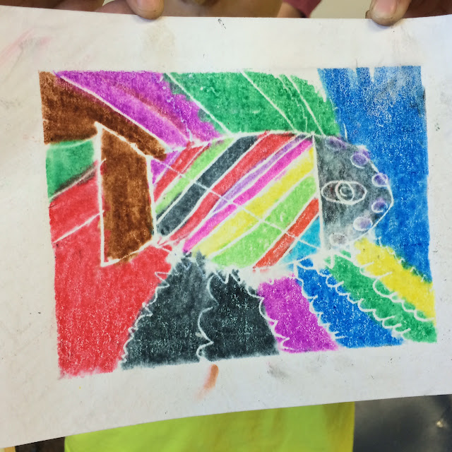
*One of my 2nd grade classes only got to see me twice for a total of an hour so they printed fish inspired by Sandra Silberzweig.

Sandra Silberzweig "Wild Tribal Sun Fish"


Phew! Printmaking is a blast.
Thanks for stopping by! If you have any questions, please leave a comment. I'd love to hear from you.


Sunday, June 5, 2016

Jasper John Self Portraits in Kindergarten


We are getting close to the end of our school year and I saved the Printmaking unit for the end. I wanted to keep these Summer ready kiddos engaged and Printmaking is a great way to do that. It is relatively easy to learn and the possibilities for artistic choice making is endless.

The kindergarten artists were practicing the most basic form of printmaking which is stamping. I instructed the students to begin by tracing rectangles in rows and columns on a large piece of drawing paper. Then they laid their pastels on their sides to color in each rectangle with different colors. They could mix colors with layers if they chose to do so. 

To help guide our art making we looked at the "Alphabet Painting" by Jasper Johns. I didn't dig into Pop Art History too deeply with the kinders but we did discuss how we were able to recognize the alphabet and that Jasper Johns liked used very recognizable images in his artwork.

Jasper Johns "Alphabet" 1959

I then place trays of various paints at tables along with foam letter sponges. The students were to rotate to tables after about 30 seconds or so to stamp their foam letters into the paint and print them inside the rectangles on their papers.

The sponges I used I bought through my district's catalog.

For time constraints and ease of sponge access, I didn't require students to put the letters in order of the alphabet.

The next day I had the students choose a piece of skin toned construction paper (I had 6 different tones to choose from)  so that we could do some guided drawing in creating their self portraits. I gave them a basic face shape to start with and encouraged them to add unique details such as freckles, missing teeth, etc.


They traced their drawings with oil pastels and glued it to their alphabet paintings. They painted their hair and added a paper shirt to finish.


Thanks for stopping by!

Wednesday, May 18, 2016

"The Great Wave" by 2nd Grade inspired by Hokusai


These artworks were developed from a simple painting exercise and color theory review. I had wanted to review proper painting technique, paint blending, and the color order of the rainbow spectrum, so my students all painted a piece of paper to demonstrate their knowledge and understanding.  After that...well...I wasn't too sure where to go next with their work.

As I stared at their painted papers I turned one vertical and thought that the warm colors could be a sunset and the cool colors, the ocean. "A-HA!" I thought! We will cut these up into layers and create a landscape inspired by Hokusai's "The Great Wave of Kanagawa".

By Katsushika Hokusai (θ‘›ι£ΎεŒ—ζ–Ž) - Restored version of File:Great Wave off Kanagawa.jpg (rotated and cropped, dirt, stains, and smudges removed. Creases corrected. Histogram adjusted and color balanced.), Public Domain, https://commons.wikimedia.org/w/index.php?curid=5576388
The art history geek squealed with glee! I love sharing important works of art with my students and this seemed like the perfect opportunity. Even though the original work is a print without all the colors of the rainbow evident, but hey...we can make imaginative interpretations.

After I passed back their rainbow painted papers, I shared the original work of art with a presentation as well as this fun video to help motivate my artists.


I then demonstrated how we were going to cut and layer our painted paper to create our own versions of Hokusai's famous print. I also gave them brown painted paper to use for their boats.


They were then encouraged to add their own details with paint. Some students got really creative with their landscapes.
Here are some of the results!


Thanks for stopping by!

Thursday, January 14, 2016

Joan Miro inspired Surreal Paper Sculptures

My teaching schedule is unique in that I see some classes twice a week. How lucky for those kids, right!? Double art! Ms. Eagle's third class is one of those lucky ducks..or should I say ducklings? They are usually finished with my planned 3rd grade lessons a week ahead of the other two 3rd grade classes. Double the art class, double the art knowledge I say!
Joan Miro "Harlequin's Carnival", 1924-25
To give these kiddos more art history I introduced them to the Spanish Surrealist painter, Joan Miro. His subject matter is very kid friendly with paintings named "Harlequin Carnival"...what kid could resist digging into it visually. I even remember a copy of that painting being hung in my own elementary school growing up.

I began by providing a brief background about Joan Miro and defined "surrealism" with the kids. Since they have handy-dandy sketchbooks they took notes on this. I defined surrealism as "the unexpected, dreamlike, nonsensical, and unreal". They seemed to really like that, as predicted!
Joan Miro, "Nocturne" 1940
I showed them Miro's "Nocturne", 1940. I asked them to look closely at the painting and explain how the imagery communicates the idea of night...since nocturne refers to night.

After 8+ students walked up and pointed out their observations, I transitioned into a game. Yep, a game. I found this "Roll A Miro" game on the internet where you can roll a die to determine which Miro-esque design you would apply to a surreal Miro-esque character.

They had a blast filling up a large piece of poster board with at least 6 characters...no bigger than their hand and no smaller than their palm

The next art class I asked the to paint their Miro characters with tempera paint. They were also asked to draw roundish bubbles around each character to prepare for the sculpture step.
The third and following class they were shown how to cut and interlock their Miro characters into a paper sculpture.  I posed this as an engineering problem. We talked a lot about how size and weight of their characters needed to be considered when interlocking them.  Some kids handled this with ease, others really struggled. The students who accomplished this task helped students who needed assistance. 
I found that this type of handwork built student character more than the actual paper used in the project.  It required these kids to plan, experiment, problem solve, overcome obstacles, persevere, and accept defeat. There were 3 students who couldn't figure out how to get all of their characters to lock together and stand up. Granted, they only had 35 minutes.


This lesson really made me want to create more sculpture projects this year. My wheels are already turning.

 Thanks for stopping by!