Instagram: Makeamark_artroom

Thursday, August 11, 2016

Baron Batch inspired Reduction prints


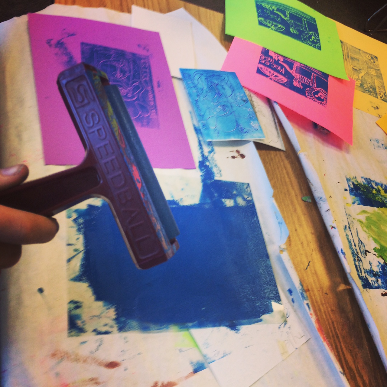
Reduction Print is a multi-color print in which the separate colors printed from the same plate at different stages. 

Reduction printmaking with foam plates was a home-run! I want to thank Mr. Stoller at Thomas Elementary Art Blog for the informative and captivating post about relief printing with his 4th grade students. I knew my students needed to learn the foundations of printmaking as most of their only prior knowledge of printing was stamping and computer printing.  I also knew my kids like to be challenged and that they would appreciate a the task of reduction printing.

I began the lesson by introducing a contemporary artist as inspiration. I presented Baron Batch. A former NFL football player and artist. We focused on his "Free Art" street painting examples for our direct influences. I chose his "Elephant" painting as the prime example for animal portraiture.


These were student objectives through the process of creating authentic art inspired by Batch:
  • I asked the students to look through wildlife magazines and choose a photograph of an animal.
  • They had to sketch an animal portrait in their sketchbooks for my review
  • They then drew a contour drawing of their chosen animal
  • Then traced that drawing onto a foam plate 
  • They had to print one color onto a piece of white printing paper
  • The next class they added more details to their animals' faces and traced it onto their plate
  • They cut away (reduction) their animal from the late and inked a 2nd different color 
  • They lined up that foam piece and pressed to print
  • Some students had time to choose one detail to cut away and print a 3rd color 
  • They numbered their editions, wrote titles, and signed their work for our print exchange
Here are some of my Youtube tutorial videos I used for my classroom printing my "Electric Elk"


Here are some of their results.


 These kids were so engaged in the process of printmaking because it was new and they could judge their successes by the quality of their prints. They had choices along the way that allowed for their individual expression and exciting Baron Batch neon colors to use in their designs.

Let me know if you have any questions in the comment section below. Thanks for stopping by!

Thursday, July 28, 2016

David Jones Dream inspired Prints by 3rd grade


Wow, Summer has just been flying by! I have been busy recharging post wedding and school year. I have been doing a lot of mountain biking, gardening, baking, hiking, traveled to Alaska, rode my bike from Seattle to Portland, and have another bike tour in the works before we start the next school year.

I will be brief in my explanations but will be photo rich! If you have any questions about the processes, inspirations, or anything at all, please write a comment on this post and I'll be sure to respond.

I will say that one helpful tool to control the printmaking madness was using the Time Timer! Wow! This thing really saved me. I would always lose track of time before this I found this beauty. If you don't have one in your art room, I STRONGLY recommend getting one.

Ok...let us start with 3rd grade.  We studied the contemporary British printmaker, David Jones. We focused on Jones' work where he creates linoleum cuts inspired by dreams. We began by looking deeply at this series to share interpretations of each print.

"The Acrobat is Alarmed by an Insect", David Jones
We then shared examples of our own dreams. We then made sketches of a personal dream on drawing paper. Their sketches had to communicate dream imagery and show 2-d texture.

After that we transferred those drawings to a piece of foam plate to prepare for printing. I flipped this lesson on printmaking for these classes, you can view it on my Youtube channel.


I limited the color scheme to blue or black ink but they could print on colored printer paper.


 I even taught them about ghost printing (printing again without re-inking). They loved that!


We wrapped it up by writing stories about our prints, sharing those prints and our stories on my document camera, and doing a print exchange. We had a great time!


Thanks for stopping by!

Monday, July 11, 2016

National Board Certification: the journey begins...


Add caption
You read it correctly. I've begun the arduous journey of pursuing my National Board certification in Art Education. If you aren't sure what that means, it is the gold standard in my profession. I've been a certified art teacher for 9 years and I believe I am ready for this next step.

I will spend 4 days at "Jump Start" this August training in Snohomish, Washington. This professional development will get me off on the right foot. I'm really excited about going for it. It will take me 2 years to complete the 4 components. There are several art teachers in my district that are also pursuing board certification so I won't be alone.

I'll post some things here and there on this blog. I truly hope that by working towards this goal that I will become a better teacher and my students will benefit from all of my hard work.

Here we go!

Printmaking Bonanza Part 1: Kinder -2


It is Summer and I have to admit, my blogging fell to the wayside. I got married a couple of weeks ago and let's just say writing up posts wasn't a priority in the final weeks of school.

I finished my last day of teaching this year on June 20th and was married 5 days later. The last big unit I taught my kiddos was printmaking and now that I've had some time to reflect, I am ready to share our successes.

This is only my 2nd year teaching art at my elementary school. Most of my students haven't had many or any art classes before they met me. I didn't get to printmaking with them last year because I had so much groundwork to lay down but I made sure to cover it this year.

Here is what we did in the primary grades. I'm not going break down all of the steps here on the blog because I made some videos on my youtube channel. If you want to know more, please submit comment below.

Kindergarten: Wayne Theibaud inspired Gum ball machine prints.
We have been studying pop art in Kindergarten and what more fun way to experiment with printmaking than be inspired by Wayne Thiebaud's 1963 painting "Three Machines".

Wayne Thiebaud "Three Machines" 1963


oooooo! gold paint!

We practiced printing lines with cardboard, and circles with recycled glue stick caps.


1st grade: We practiced printing by using styrofoam plates and used the crayola marker ink to color and print them  on wet paper. We drew cupcakes and angry birds to go with the whole Pop Art theme. Unfortunately didn't get any photos because I have 30 kids in these classes at the very end of the day....I'm usually running on fumes at this point of the day.

2nd grade: We first experimented with mono-printing by painting colorful landscapes inspired by contemporary English printmaker Chris Keegan. We quickly painted tempera on plastic transparency with thick paint strokes and pressed/rubbed paper on the wet paint to pull our prints.
Chris Keegan "Brilliant Sky"


We then used styrofoam plates to draw an angry bird. We colored them with crayola markers and printed them on white drawing paper. We cut these out and collaged them on our dried landscape paintings to make an Angry Birds game course. We glued a small piece of cardboard to the back of the Angry Birds to make them appear to fly. The kids LOVED this.

*One of my 2nd grade classes only got to see me twice for a total of an hour so they printed fish inspired by Sandra Silberzweig.

Sandra Silberzweig "Wild Tribal Sun Fish"


Phew! Printmaking is a blast.
Thanks for stopping by! If you have any questions, please leave a comment. I'd love to hear from you.


Sunday, June 5, 2016

Jasper John Self Portraits in Kindergarten


We are getting close to the end of our school year and I saved the Printmaking unit for the end. I wanted to keep these Summer ready kiddos engaged and Printmaking is a great way to do that. It is relatively easy to learn and the possibilities for artistic choice making is endless.

The kindergarten artists were practicing the most basic form of printmaking which is stamping. I instructed the students to begin by tracing rectangles in rows and columns on a large piece of drawing paper. Then they laid their pastels on their sides to color in each rectangle with different colors. They could mix colors with layers if they chose to do so. 

To help guide our art making we looked at the "Alphabet Painting" by Jasper Johns. I didn't dig into Pop Art History too deeply with the kinders but we did discuss how we were able to recognize the alphabet and that Jasper Johns liked used very recognizable images in his artwork.

Jasper Johns "Alphabet" 1959

I then place trays of various paints at tables along with foam letter sponges. The students were to rotate to tables after about 30 seconds or so to stamp their foam letters into the paint and print them inside the rectangles on their papers.

The sponges I used I bought through my district's catalog.

For time constraints and ease of sponge access, I didn't require students to put the letters in order of the alphabet.

The next day I had the students choose a piece of skin toned construction paper (I had 6 different tones to choose from)  so that we could do some guided drawing in creating their self portraits. I gave them a basic face shape to start with and encouraged them to add unique details such as freckles, missing teeth, etc.


They traced their drawings with oil pastels and glued it to their alphabet paintings. They painted their hair and added a paper shirt to finish.


Thanks for stopping by!